2018 Web Design Trends
Aug 23rd, 2018


Share
We’ve passed the halfway mark in 2018. It’s seen some very new styles. A few have made historic comebacks. It’s been very exciting. Here’s a look into those amazing trends that have been dominating the web
1. Break the Grid
Rectangular Grids have long been dear to a lot of developers.
Sorry to say, but it has to take the back seat now! Designers have been exploring a plethora of layout styles.
While the traditional websites might not be immediately receptive to break the grid, there are a lot of others who have already boarded the bandwagon.

Via: Elix

Via: Ofo
2. Animations & Micro-Interactions :
It seems unfair to place both these topics under the same point.
However, character/particle animations and micro-interactions achieve the same outcome: They make the product interactive.
The difference between a good product and a great product is the attention to detail.
Your website exists to make the customer engaged and these animations work wonders.
You can use these to either be the central point of focus or complement an existing element.

Animation designed by: Svetlana L.

Microinteraction designed by: Paarth Desai

Microinteraction designed by: Johny Vino
3. Combination of gradient & flat colors
Flat colours dominated 2017. They were a hit.
Gradients came back stronger this year and it looks like web designers are making them more vibrant than ever.
What’s been unique to 2018 is the combination of flat colours and bold gradients used in illustrations.
They are an eye candy! You’ll understand what I’m talking about when you go through the following images.

Design by: Nugraha Jati Utama

Design by: Cuberto

Design by: Zahidul
4. Isometric
Having initially picked up steam in the gaming industry, creative isometric illustrations have taken the web design industry by storm.
This is one of the trends that have been widely accepted by companies of all sizes and all industries.
From banking to FMCG to freelancers, everyone has open heartedly received this trend.

Isometric illustration designed by: Aga Jucha

Isometric illustration designed by: Rwds

Isometric illustration designed by: Walid Beno
5. Minimalistic Text & Negative Spaces
Text has been on steroids in 2018.
Designers have been experimenting with creative typography a lot and the results are splendid.
Text, when used minimally, contribute to the overall aesthetic appeal of the design.
Also, designers are not new to the concept of minimalism. Born from it, is the idea of negative spaces. It has been a key element in architecture, interior designing, and arts.
Now, it has found a large fan following in web designing as well.

by: Gülçin Gümüş

by: Ali Sayed

by: Nathan Riley

by: Alex Eiman
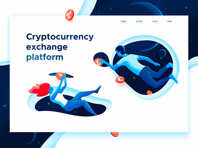
6. White-masked illustration.
This is a trend that’s rather picking up momentum this year.
It’s one of those trends that have not been exposed to a lot of designers as of yet.
But it’s sure to reach masses.
It mostly comprises of a bold and vibrant illustration masked by a plain white background.
If there is one trend you are planning to use today that has not become very common, let this be it.

White Mask Illustration by: stian

White Mask Illustration by: Peter Deltondo

White Mask Illustration by: Leo Natsume

White Mask Illustration by: Ted Kulakevich

White Mask Illustration by: Dmitrii Kharchenko
7. Deep Understanding of Responsive design
Many designers and front-end developers assume that the font sizes and images sizes should become smaller as you go from higher breakpoints to the lower.
However, that is not true.
It’s a rookie mistake.
The distance between the user and the screen is the parameter to ascertain font sizes and image scale. Not the screen resolution.
Mobile phones are kept the closest to the user, followed by tablet.
However, laptops, small desktops, and large desktops are all kept at the same distance even though the screen sizes differ.
You may wrap the text and crop the image for laptops and desktops, but not vary the size.
Similar to this, there are plenty of other such intricacies in responsive design that demand a thorough learning.
Understanding such deep responsiveness is a trend that is often overlooked, but one that guarantees beautiful user experience.
There you have it!
These are 7 Web trends that are dominating in 2018.
Hope you all liked it.
Tanuj Shah
CEO at Userfacet
Formally educated in HCI, Tanuj is adept at understanding user experience patterns and creating solid technological solutions around them.
Advanced UX Tips
Get actionable tips on user experience designs, delivered straight to your inbox.

